Sunday, June 29, 2014

Rare Severe Thunderstorm Warning

On Monday, June 23, 2014, the Fairbanks National Weather Service Office issued a Severe Thunderstorm Warning for the southern Yukon Flats (AKZ 220).

WUAK59 PAFG 240411
SVRAFG
AKZ220-240430-
/O.NEW.PAFG.SV.W.0001.140624T0411Z-140624T0430Z/

BULLETIN - IMMEDIATE BROADCAST REQUESTED
SEVERE THUNDERSTORM WARNING
NATIONAL WEATHER SERVICE FAIRBANKS AK
807 PM AKDT MON JUN 23 2014

THE NATIONAL WEATHER SERVICE IN FAIRBANKS HAS ISSUED A

* SEVERE THUNDERSTORM WARNING FOR...
  SOUTH CENTRAL YUKON FLATS AND SURROUNDING UPLANDS IN ALASKA 50 
  MILES NORTHWEST OF TWELVEMILE SUMMIT...

* UNTIL 830 PM AKDT

* AT 807 PM AKDT...DOPPLER RADAR INDICATED A SEVERE THUNDERSTORM
  CAPABLE OF PRODUCING QUARTER SIZE HAIL. THIS STORM WAS LOCATED 50
  MILES NORTHWEST OF TWELVEMILE SUMMIT...AND MOVING NORTH AT 5 MPH.

The last time a Severe Thunderstorm Warning was issued anywhere in Alaska was on July 11, 2010 (AKZ 222 near Twelvemile Summit). There are people far more qualified than I am to discuss the atmospherics of this event; however, I did want to show a few maps of the region and some of the radar products. On each map, the trapezoid represents the coordinates of the warned area. Some of the interesting features include the 3.27"/hour maximum precipitation rate and the 90% probability of hail statistic (a text product).

Figure 1. Location map of Severe Thunderstorm Warning.

Figure 2. Base Reflectivity map of Severe Thunderstorm Warning.

Figure 3. Cloud to height map of Severe Thunderstorm Warning.

 
Figure 4. Storm Relative Velocity map of Severe Thunderstorm Warning.

 Figure 5. Instantaneous Precipitation Rate map of Severe Thunderstorm Warning.

Figure 6. Vertical Integrated Liquid map of Severe Thunderstorm Warning.


Saturday, June 28, 2014

Wet Rest of Summer?

Fairbanks has now tied the all-time record for June total precipitation (3.55", tied with 1949), so it's natural to ask whether this has any statistical implications for the rest of the summer.  In other words, based on the historical data, does a wet June portend a washout for the rest of the summer?  This is a straightforward analysis to perform: see the scatterplots below for June precipitation versus precipitation in July and in August; the horizontal gray lines show the median value for July and August (1.71" in both months, as it turns out).  There is a hint of a positive correlation for July, as the very driest Junes have generally been followed by dry Julys, and a wet July is slightly favored after a wet June.  The two wettest Junes were in 1949 and 1955, and both saw a wetter than normal July.  August rainfall, on the other hand, shows no discernible connection to June rainfall.

Looking at mean temperatures in July and August (see below), there seems to be a suggestion - more for August than for July - that June precipitation is slightly positively correlated with temperatures later in the season.  1949 and 1955 are obvious exceptions, but these were negative PDO summers, unlike this year.  Here are the June PDO index values for the top 8 wettest Junes in Fairbanks:

1949  -0.70
1955  -2.44
1977  +0.42
1970  +0.06
1989  +0.36
1994  +0.46
1988  +0.74
1962  -1.62


Given this information, we probably shouldn't be too surprised if July is also damp in Fairbanks, but it doesn't seem particularly likely that the recent unusual coolness will continue.  With warmer than normal water in most of the North Pacific this summer, unusual warmth appears to be a more likely outcome for the late summer.

With the PDO phase apparently not closely related to June precipitation in Fairbanks, what else can we identify as a possible cause?  I would suggest (as I did last summer) that the Quasi-Biennial Oscillation bears some responsibility for climate variations at this time of year.  The chart below shows the June QBO index value plotted against June precipitation, and suggests that precipitation is enhanced when the QBO is strongly negative.  Monthly QBO index values from the past 3 years are shown in the last chart below; we can see that the QBO was strongly positive last summer, and continued positive through the winter, but finally turned negative for the May average and has probably been significantly negative this month.  While this by no means guarantees a wet June, it does seem to raise the odds; and I would also suggest that if the QBO becomes strongly negative by August, then it will favor a relatively warm month then.


Wednesday, June 25, 2014

Annual Normal Temperature Visualization

Annual Normal Temperature Visualization If you haven't figured out by now, I enjoy tinkering with data and seeing how it looks on a map. As the saying goes, when you have a hammer (GIS), you look for nails to hit (climate data). In this case I wanted to see how the NCDC climate normals look when put into motion. In the past I made date specific maps of climate normals of monthly normals but not for every day of the year. The YouTube video below shows a side-by-side pannel of all 365 daily normals (high temperature on left and low temperature on right). The colors (categories) are based on the 189 stations in Alaska that have published normals (some using as little as 10 years worth of data). An inverse distance weighted (IDW) surfacing algorithm was used to interpolate values between points.


For a clearer animation, HERE is the standalone high temperature animation and HERE is the standalone low temperature animation.

If you are interested in seeing what the entire U.S. looks like, here is the companion video that focuses on the Lower 48.

Tuesday, June 24, 2014

Precipitation Update

Earlier in the month we noted that Fairbanks precipitation had amounted to only about half of normal for the year to date, but the recent heavy rainfall has now completely erased this deficit; so 2014 is back to near-normal based on the mean climatology.  The median precipitation by this date is a little less - just under 3 inches.

Heavy rain has also occurred in Barrow: 0.49 inches yesterday, which is the second highest daily amount ever reported there in the month of June.  This continues a pattern of above-normal precipitation in Barrow that has persisted since March of last year; in the nearly 18 months since 2013 began, Barrow has seen nearly twice its normal precipitation.  The wettest periods relative to normal were March through September of last year, November and December of last year, and May 2014 through the present.  I've plotted the sea level pressure anomaly in each of these periods below; note the strong similarity in terms of the above-normal pressure in the Bering Sea.  It appears that this recurring anomaly has helped create a favored path for weather disturbances across the North Slope.


Update: the map below shows the correlation of annual mean sea surface temperature with annual mean sea level pressure at St Paul Island, which is located close to the center of the high pressure zone in the three maps above.  This is a negative PDO pattern, and indeed the annual mean PDO index values are correlated at -0.47 with the annual mean pressure at St Paul Island.  A negative PDO phase favors high pressure in the Bering Sea, although the correlation is only found in November through April.

The PDO was negative throughout 2013, so this may explain the high pressure in the Bering Sea last year, but it doesn't explain the recent persistence of the pattern, because (a) the PDO is now positive, and (b) the correlation goes away in summer.  So I don't have an explanation for the remarkable persistence of the pressure anomaly; and I would suggest that the profound seasonal changes in climate dynamics make it unlikely that a single cause can be identified.


Monday, June 23, 2014

Lightning Frequency

I'll beat the lightning theme to death one last time today. In the last few weeks, I have added lightning-themed posts, herehere, and here. In today's post, I took the 1,884,764 lightning strikes in the BLM lightning archive (1986-2010) and computed a density of strikes. To do this, I created a raster grid of Alaska where each cell is 10 square miles. The GIS software then counted the number of lightning strikes that occurred in each cell and divided by 27 (years) and then by 10 (square miles per grid cell). The resultant map shows the frequency of cloud-to-ground lightning strikes. Figure 1 shows the raw computation of lightning frequency. For visual purposes, I ran a 3x3 mean filter across the data to remove a lot of the noisiness in the map. Figure 2 shows a smoother, more aesthetically pleasing representation of lightning frequency.

The lightning data is fairly similar to the thunderstorm climatology map that NOAA produced in their 1976 report on thunderstorm climatology in Alaska. Their report showed the greatest density in the Fortymile Country whereas the BLM's lightning data indicates the area immediately east of Fairbanks has the highest density of lightning strikes.

Figure 1. Raw number of lightning strikes per square mile in Alaska (1986-2012). Grid cells are 10 square miles.

Figure 2. Smoothed number of lightning strikes per square mile in Alaska (1986-2012). Grid cells are 10 square miles and the data were smoothed using a 3x3 mean filter.


Figure 3. Figure 7 from 1976 NOAA report on thunderstorm climatology in Alaska.

Sunday, June 22, 2014

A Little Cool in Barrow

It's not often there is a cool anomaly to point out in Barrow, but the past month has actually been a little cooler than the 1981-2010 normal at Alaska's northernmost extremity; the chart below shows the daily mean temperature compared to normal since April 1.  This cool anomaly comes immediately after Barrow had its warmest year on record for the period June 1 - May 31.

Barrow has yet to break the 40 °F barrier this year, which is rather unusual by the time the summer solstice arrives; the last time 40 °F was first exceeded this late was in 1974.  The culprit appears to be an absence of southerly flow, due to higher than normal pressure over the ocean to the northwest, and lower than normal pressure over land to the southeast (see map below).

The third figure below shows the annual sum of thawing degree days up to June 21, and the total so far this year is a little lower than in most recent years (though by no means exceptional).  It will be interesting to see if unusual warmth soon returns or if - as the CFSv2 ice forecast seems to think - the summer might remain relatively cool.


Evaporation Calculations

As a follow-up to my recent post about potential evaporation rates in Fairbanks last summer, I decided to go one step further and include the effect of wind speed and solar radiation.  Higher wind speeds and higher solar radiation both increase the rate of evaporation from land, water, and vegetative surfaces, and so it's of interest to see whether these factors also contributed to high moisture loss last summer.  Hourly radiation, wind, temperature, and humidity data are recorded (among other variables) at the Fairbanks Climate Reference Network (CRN) site, which is located at 1140' elevation about 10 miles northeast of Fairbanks.  Based on this data, and with a requirement for no missing hourly reports in each 24-hour average, I calculated the theoretical daily evaporation rate from an evaporation pan (formula supplied on page 11-12 of this document - thanks Brian).

The chart below shows the monthly mean calculated evaporation rate during the growing season months since 2011.  Unfortunately the humidity measurements did not come online at the Fairbanks CRN until August 2010, so it was not possible to include a larger number of years.  Nevertheless, the results confirm the very high evaporation rate in June 2013, and interestingly the evaporation was higher in each month from May through August 2013 than in the same months of the previous two years.  The theoretical evaporation from June 2013 amounted to well over 8 inches for the month, which is not much less than the precipitation total for the entire year in Fairbanks.

Looking at the solar radiation and wind speed in isolation (see below), the solar radiation was higher last year in May and June than in the same months of any of the previous 10 years.  The wind speed was also a little higher than normal in June and July.  (The reported wind speed looks much too low for May and June of 2011, but I double-checked the data and this is what the supposedly high-quality CRN platform reported.  There is no evidence of lower wind speeds in these months at Fairbanks airport.)

In conclusion, the CRN data confirm that Fairbanks-area land-surface moisture loss in summer 2013 was caused not only by dry air but also by abnormally sunny conditions.  Of course we would expect these two anomalies to go together; both were quite extreme last summer, leading to highly elevated moisture removal rates.  Fortunately, fire activity was not catastrophic as in 2004 - probably because of lack of lightning.  Here's what the state 2013 fire report had to say: "2013 will be remembered as one of the shortest, but hottest summers on record... Fuel conditions reached near record dryness at some locations... Despite many record-setting hot temperatures, the stable high pressure kept thunderstorms at bay, and lightning to a minimum... With many comparisons between the hot, dry summers of 2004 and 2013, it seems that the lack of lightning, and therefore the lack of natural fire starts, is what kept the 2013 fire season from becoming catastrophic."


Saturday, June 21, 2014

Interior Flooding

Flooding from the regionally heavy rains continue on this Summer Solstice Day 2014. The Salcha River at the Richardson Highway Bridge crested at 11pm Friday with a gauge height of 18.34 feet, as seen in this hydrograph:
Image Courtesy of the Alaska-Pacific RFC
This is the fifth highest crest of record for the Salcha, and the third highest summer crest (the other two being spring break-up floods), and the highest summer crest since August 1986.

On the Chena River, the river crested at the Granite Tors Campground late Friday morning and has now reached the Moose Creek flood control project. At both the upper Chena and Hunts Creek guage (above the dam) this was the 6th highest of record and highest crest since 2003.
Image Courtesy of the Alaska-Pacific RFC
As of late Friday evening there was water into low spots on the Chena in town Fairbanks, including the bike path at Pioneer Park.

In addition to the rainfall totals Brian posted last evening, some event totals (from the evening of June 17 through the evening of Jun 20) from cooperative and other observers include:
  • Salcha River 20 Mile: 3.09 (thru morning of the 20th)
  • Gilmore Creek: 2.81"
  • Fairbanks 11NE CRN (at Gilmore Creek): 2.79"
  • Aurora: 2.74"
  • Goldstream Valley Bottom: 2.64
  • North Pole: 1.97"
  • UAF West Ridge: 1.73"
  • Keystone Ridge: 1.73"


Friday, June 20, 2014

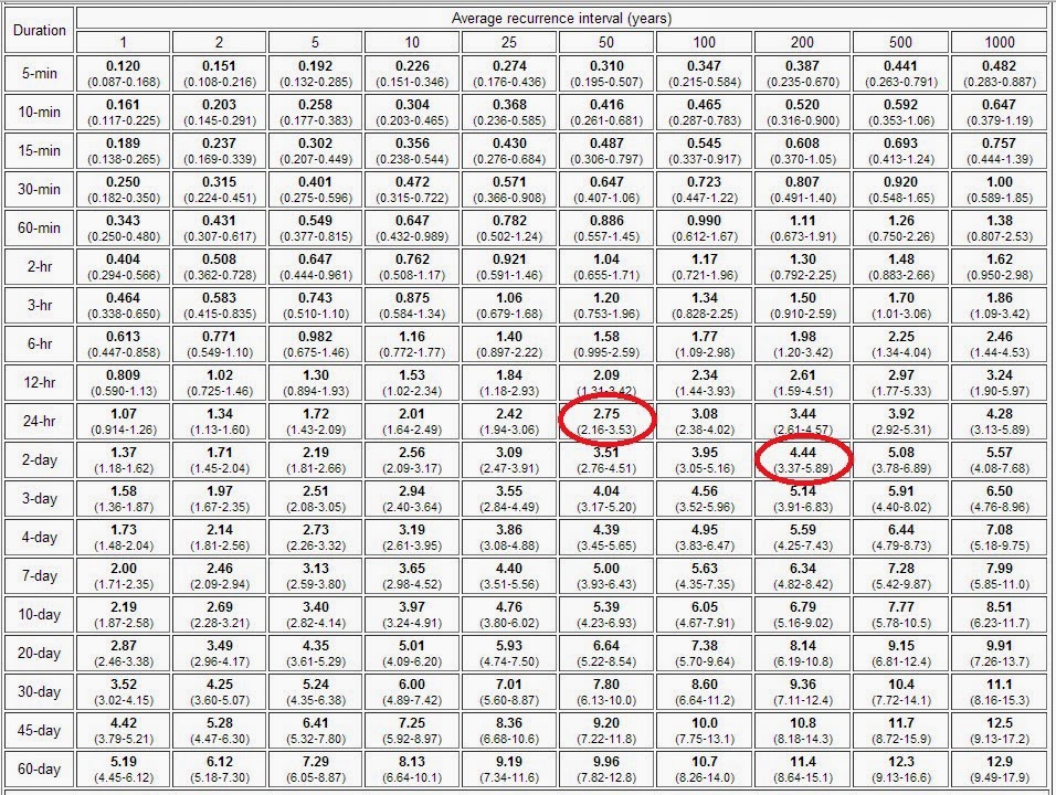
200-Year Rainfall Event

A significant rainfall event is winding down across the eastern Interior of Alaska. Many areas east of Fairbanks received in excess of 3" or rain. Figure 1 shows a regional map of precipitation data obtained from the University of Utah's Mesowest Site. Figure 2 shows the data used to make the map.

The 'winner' was the Goodpasture RAWS station. They recorded 2.75" on June 18th and 1.92 on June 19th. The 2.75" in 24-hours has a 50-year recurrence interval and the 4.67" in 48-hours is slightly more than the 200-year recurrence interval. Figure 3 shows the 

Figure 1. Map showing 5-day precipitation totals in the Eastern Interior of Alaska. All data was obtained from the University of Utah's Mesowest Site.


Figure 2. Table showing 5-day precipitation totals in the Eastern Interior of Alaska. All data was obtained from the University of Utah's Mesowest Site. Two values highlighted in red are questionable and were excluded from the map.


Figure 3. Precipitation recurrence interval table for the Goodpasture RAWS station. Data obtained from here.


Sunday, June 15, 2014

Lightning and Solar Activity

Is there a correlation between solar wind and lightning activity here in Alaska? The short answer is: maybe.

Last month there was some buzz regarding an article in the journal Environmental Research Letters showing a correlation between lightning frequency and the solar wind. The solar wind carries enormous quantities of charged particles from the sun in all directions. Since lightning is an atmospheric process that brings the electromagnetic state into local equilibrium, it stands to reason that the addition of charged particles into the earth system might have an influence on the rate of lightning strikes.

The British researchers looked at data from the Advanced Composition Explorer (ACE) satellite and lightning data in Great Britain. Their study used the median value of the "Vy" variable as a proxy measure of solar wind intensity. They did a lot of work to glean the peak occurrences and to determine intervals on either side of the peak. Make no mistake, they did a robust study. What I present here is not nearly as robust.

There are actually a number of sensors on the ACE satellite so what I did was to select days with at least 1,000 lightning strikes in Alaska during the months of June and July between 1998 and 2011 and to see how the solar wind variables compared to the number of lightning strikes. Those years were selected because that is when the satellite was fully operational. June and July were selected because they are the peak lightning months in Alaska. For ease of analysis, the number of strikes was put into one of 6 categories. (Note: 40% of June and July days saw over 1,000 lightning strikes).

Four variables are mapped. 1) plasma speed, 2) plasma temperature, 3) Vy and 4) Vx. Items 1 and 2 are pretty straightforward. The sun emits charged particles that are one phase hotter than gasses; i.e., plasma. Items 3 and 4 are a little more confusing. They represent how much the ACE sensor was deflected in the X and Y direction by the solar wind using local (gsm) coordinates. The X direction is how much it is deflected toward the earth; hence, large negative values of Vx for a strong solar wind. The Y direction is perpendicular to the X direction. Figures 1 through 4 below correspond to the four variables described in the previous paragraph.

Unsurprisingly, the intensity of the solar variables corresponds to the rotation of the sun about its axis. At the sun's equator, it rotates once every 25 days and at near the poles it rotates once every 36 days. The variables used in this study have a period of approximately 27.7 days.

Clearly, a relationship exists. The trends are unmistakable but the magnitude may be just background noise. This is a cursory study and is certainly not authoritative. Mainly it is just food for thought.

Figure 1. Plasma speed compared to lightning strike groups.

Figure 2. Plasma temperature compared to lightning strike groups.

Figure 3. Vy compared to lightning strike groups.

Figure 4. Vx compared to lightning strike groups.


Note: This is a cross-posing from my super secret FB page.

Friday, June 13, 2014

Bias-Corrected Sea Ice Forecast

This is a follow-up to Monday's post about the latest CFSv2 model forecast of much higher Arctic sea ice extent this summer and autumn.  In that discussion I showed that the model is predicting that the September mean ice extent will be the highest since 2001, but this does not consider the bias in the model forecasts.  Numerical weather prediction models always contain a certain amount of systematic error or bias, and therefore any careful analysis of the forecasts requires a bias correction to be performed by comparing the latest forecast to the forecasts that have been made in the past.  To allow users to do this, NOAA helpfully provides a complete history of "re-forecasts" (emulated forecasts) back to 1982 for the CFSv2 model; so I downloaded the history of sea ice forecasts made on June 10 and obtained a complete history of forecasts for September mean Arctic ice extent.

The chart below shows the history of June 10 forecasts, along with the observed September ice extent according to the National Snow and Ice Data Center.  Ice extent was defined as the area covered by at least 15% concentration of sea ice in the model, which matches the NSIDC definition.  Interestingly the model forecasts have a low bias over the entire history - see the bottom of this post for a discussion of this.  However, in recent years the forecasts have failed to capture the extent of the melt-out, i.e. the June forecasts have predicted much less change over time than has actually happened.

If we compare the forecast and observed ice extent to the 1982-2010 mean of each series, then we have a bias-corrected comparison, see below.  The model failure in recent years really stands out, but it is also clear that there is some skill in predicting the year-to-year variability.  This year's forecast is also really dramatic, because the model is predicting the highest extent since 1992 when compared to itself.  It seems highly unlikely that anything of this magnitude will actually happen, but it also seems likely that the model is capturing some kind of signal.  Based on my experience in seasonal forecasting, it is usually worth paying attention when the models show large anomalies, although usually the timing, magnitude, or location of the predicted anomaly is not quite right.


In regard to the low bias in the model forecasts, at first glance this appears to be the opposite of the bias claimed by the model developers in their published article (as helpfully pointed out by Brian): "For the sea ice prediction, sea ice appears too thick and certainly too extensive in the spring and summer... The model shows a consistent high bias in its forecasts of September ice extent."  The figure below is taken from the article and shows (in the lower left panel) that the June 15 forecasts produce ice concentration that is too high compared to the observations.  However, ice concentration is not the same as ice extent, and it seems possible that the model could be producing ice that is too densely concentrated but yet the 15%-area is too small.  I haven't yet obtained a history of observed sea ice concentration to be able to test this idea.


Wednesday, June 11, 2014

Fairbanks Airport Temperatures

*** Updated with Anchorage charts for comparison at bottom of post ***

There are two climate sites at the Fairbanks International Airport. The main station is called Fairbanks International Airport. That is the official climate site. The secondary site is called Fairbanks Airport #2 and is closer the the terminal. When looking at the May data a few days ago, I noticed that the secondary site was actually below normal for the month wile every other station in the region was above normal (See Figure 1). As it turns out, the average daily temperature at the #2 site was 3°F less than at the primary station. Figure 2 shows the locations of the two stations as shown in the NCDC records and the May 2014 monthly temperature and departure from normal.


Figure 1. May 2014 daily average temperature at Fairbanks International Airport and Fairbanks Airport #2.

Figure 2. Station location for Fairbanks International Airport and Fairbanks Airport #2 along with the monthly average temperature and departure from the 1981-2010 normal. Note: the Airport #2 site uses an 11-year period of record for their normal calculation.

This begs the question of whether one station is reporting inaccurate temperatures. Since the primary site's temperature departure is consistent with the other regional stations, I am inclined to place much more weight on the primary station than the #2 station. Figure 3 shows the statewide departure from normal for the month of May 2014. With the exception of the area around Bettles and Nome, all of Alaska was above normal for May.

Figure 3. Statewide temperature departure from 1981-2010 normal.

Looking back of the Fairbanks Airport #2 period of record and comparing it to the Fairbanks International Airport station during the same time period should provide a good assessment of whether there is a consistent temperature bias. Figure 4 indicates that the Airport #2 site is consistently cooler than the main climate site. The average annual difference is 1.4°F. 

Figure 4. Fairbanks International Airport and Fairbanks Airport #2 annual temperatures from 2000 through 2013.

Figure 5. Average monthly temperature difference between Fairbanks International Airport and Fairbanks Airport #2 from 2000 through 2013. Positive numbers indicate that the Fairbanks International Airport site was warmer.

Perhaps more interesting is the strong and consistent seasonal variation. As we can see in Figure 5, there is temperature parity during the months of February, March, and April. However, that transitions into a strong temperature differential for the remainder of the year – peaking in the high sun months.

So why is there a difference and does it matter? The answer to the first question is difficult to answer without inspecting the station equipment and its siting.Figure 6 shows the locations of the Fairbanks International Airport station since 1929. Interestingly, the location from 1952 to 1997 is very close to the current Fairbanks Airport #2 site. It is possible that they might actually be the same location.

In my opinion, the Fairbanks Airport #2 temperature readings are too low. As for the why does it matter question, the short answer is that better data always yields better results.

Figure 6. Station history for Fairbanks International Airport site from 1929 to present. Source: http://www.ncdc.noaa.gov/homr/

**************************************************

For comparison, I added three of the four main stations in Anchorage: Anchorage Forecast Office (PAFC), Anchorage International Airport (PAFC), and Anchorage Merrill Field (PAMR). I excluded Lake Hood (PALH) since it is located right next to a large body of water. The Forecast Office and the International Airport are pretty close to each other and are both quite close to the moderating influence of Knik Arm. Merrill Field is several miles inland and has a slightly more inland climate. That is particularly apparent in the warmer temperatures during the summer months. All-in-all, there is very little annual and monthly variability in the readings between the stations. The Forecast Office and the Airport have highly similar temperatures as one would expect – and as I would expect in Fairbanks. The Merrill Field temperatures are a little bit warmer on an annual basis. I attribute this to it being located in a more urbanized setting.


Figure 7. Anchorage, Alaska, annual temperatures from 2000 to 2013 for the Anchorage Forecast Office (PAFC), Anchorage International Airport (PAFC), and Anchorage Merrill Field (PAMR).

Figure 8. Anchorage, Alaska, monthly temperatures from 2000 to 2013 for the Anchorage Forecast Office (PAFC), Anchorage International Airport (PAFC), and Anchorage Merrill Field (PAMR).


Monday, June 9, 2014

Increased Ice Extent This Autumn?

An intriguing long-range forecast has emerged recently from the NWS Climate Forecast System (CFSv2) model, which makes predictions of global climate conditions up to 9 months into the future.  The model is quite sophisticated and often does provide considerable insight into likely future climate anomalies; but recently the model has increasingly portrayed a scenario that seems implausible at first glance; the model is showing a notable uptick in Arctic sea ice extent (compared to recent years) during this year's melt season.  Given the remarkable and persistent warmth in the Arctic in recent years, and the strong trend for increasing autumn melt-out, it would be quite an interesting change if this year brought significantly higher ice extent - and it would be a considerable success for the CFSv2 model.

The chart below shows the most recent Arctic sea ice extent forecast from the model, showing a predicted mean extent of over 6.5 x10⁶ km2 in September.  The observed September extent since 1979 is shown in the second figure below; the big melt years were 2007 and 2012.  Last year saw a large rebound, but if the CFSv2 forecast is correct, the ice area this year will jump back up to a level not seen since 2001; this would certainly generate a great deal of discussion and interest in the climate community and beyond.


The maps below show the spatial distribution of the CFSv2 anomalies in the next three months.  Curiously, the model is showing anomalous ice cover persisting in the coastal margins of the Arctic Ocean from the Laptev Sea all the way around to the Beaufort Sea and the Canadian Arctic Archipelago; but the model shows a lack of sea ice farther north.  It is not clear if this is at all realistic; but I would note that last year the model performed rather well in predicting the September ice extent, and so I don't think the latest forecast can be dismissed out of hand.  The last chart below show the forecast from this time last year; the September 2013 ice extent verified at 5.4 x10⁶ km2, and so the forecast from June was just about spot on.

For those who may be interesting in following the CFSv2 forecasts, here is the website (scroll to the bottom for sea ice):

http://origin.cpc.ncep.noaa.gov/products/people/wwang/cfsv2fcst/